Does Nano Banana 2.1 give you enough control for a finished design, or is Nano Banana Pro worth the extra cost? We compare exact text, infographic structure, product placement, and reference-based edits alongside Google’s official API rates.
The same prompts make the differences visible: accents that survive, steps that repeat, and changes outside the requested edit. Each task includes the brief, the actual images, and the corrections the output would need.
If you work across several models, グローバルGPT offers a multi-model subscription. The samples below were generated through API requests.
Nano Banana 2.1 vs Nano Banana Pro at a Glance
Nano Banana 2.1 emphasizes efficiency; Nano Banana Pro emphasizes complex visual work and creative control. These are Google’s product positions. The tests check how the named API options handle the same requirements.
| 違い | Nano Banana 2.1 | ナノバナナプロ |
|---|---|---|
| Official API model ID | gemini-nano-banana-2.1 | ジェミニ-3-プロイメージ |
| 主な位置付け | High-efficiency generation and conversational editing | Complex visual tasks and precise creative control |
| Image output resolutions | 1K, 2K, 4K | 1K, 2K, 4K |
| Model inputs | Text, images, video, PDF | Text, images |
| Input context limit | 131,072 tokens | 65,536トークン |
| 座礁の検索 | Web and image search | ウェブ検索 |
| References in the official guide | Up to 14 total; up to 10 object or 4 character images | Up to 14 total; up to 6 object, 5 character, or 3 style images |
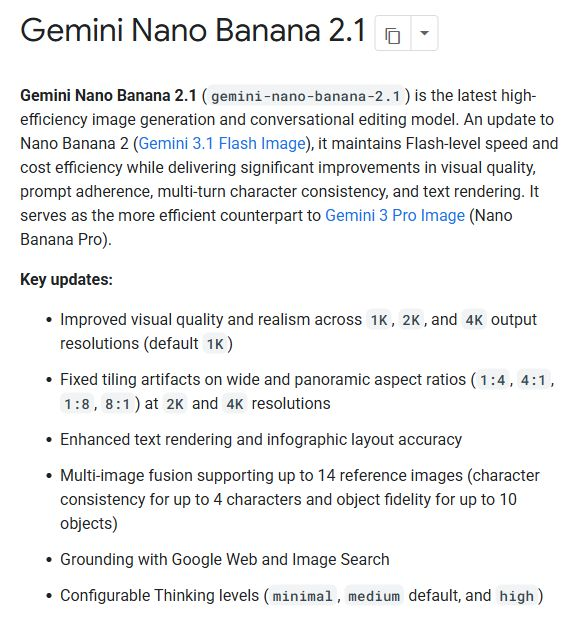
出典: Google’s image-generation guide, the 2.1 model page, そして the Pro model page, checked October 8, 2026. Reference categories share a total limit; they are not separate allowances you can add together.
- 2.1 is a different model from Nano Banana 2. Its official ID is not
gemini-3.1-flash-image. - Both support image creation and editing. A Pro label does not establish that it will follow every constraint more accurately.
- Resolution is a delivery setting. A 4K file can still contain wrong words or the wrong number of objects.
For the previous version’s background, see our 「Nano Banana 2」と「Nano Banana Pro」の比較. Its older-version findings should not be carried over to 2.1.
Public Benchmarks
Image-preference benchmarks help assess overall appeal. Our checks focus on whether a design follows exact text, count, layout, and preservation requirements.
| Benchmark lens | What it helps you assess | What still needs a task-level check |
|---|---|---|
| Text-to-image preference | Overall appeal across a pool of prompts | Exact wording, counts, and layout constraints |
| Image-edit preference | How people judge an edited image | What changed outside the requested area |
| Constraint checks in this review | Whether an output fulfills this brief | Performance on other prompts and settings |
We could not verify a current, same-leaderboard score pair for Nano Banana 2.1 and Nano Banana Pro on October 8, 2026. We therefore do not publish a numeric rank gap. Scores for Nano Banana 2 would answer a different comparison. Arena’s text-to-image leaderboard is a reference point for broader preference results; the tests below focus on inspectable design requirements.
Same-Prompt Tests: Six Real Design Tasks
How we test
The comparison covers six task briefs. Each paired run uses identical prompts and reference inputs, with a square 1024 × 1024 request and the medium-quality setting. Search is not requested. Attempt labels below identify the complete pairs shown for each task.
Sample coverage: Seven complete pairs, or 14 output images: one pair for each of the six tasks, plus a second infographic pair. Each image below links to its original file.
- Keep complete pairs. Include all reviewed, fully returned pairs; an unpaired image cannot support a comparison.
- Inspect the original output. Display copies use the same WebP conversion; output images are not cropped, retouched, or upscaled.
- Check constraints before taste. Correct strings, counts, positions, and reference preservation come before aesthetic preference.
- Record native specifications. Requested size and quality labels do not prove returned dimensions or upstream tiers.
Reference inputs: Three independent synthetic images generated with Seedream 5.0 Pro. Both options receive the same original 2048 × 2048 JPEG URLs, checked against the same file hashes. The perfume label is blank. Reference images are shown inside their tasks; they are inputs, not comparison outputs. The source-to-output size change is the same for both options.
The native 2.1 files are PNG; the native Pro files are JPEG. Both return 1024 × 1024. We compare readable text and visible constraint errors, without treating this format difference as proof of finer pixel quality. Upstream model and quality-tier mapping is not independently verified, so the findings apply to these named API options at the recorded settings.
1. Text rendering and bilingual posters
タスクの設定: A flat square poster with eight exact strings, a clear headline, accessible event details, and fully readable Spanish accents. A stylish poster with a wrong time or broken URL does not pass the brief.
For your own event brief, our Nano Banana Pro poster guide shows how to specify the copy and hierarchy before generating.
Exact prompt used for both options
Create a polished square, flat graphic poster for a fictional community design event. White background, charcoal sans-serif typography, teal and coral geometric accents. Render exactly these eight text strings, each once, with no extra words:
OPEN STUDIO NIGHT
Ideas made visible
VIERNES, 23 DE OCTUBRE
18:30 - 21:00
TALLER ABIERTO
Entrada: 12 EUR
Diseño, café y conversación
openstudio.example
Make OPEN STUDIO NIGHT the largest heading, the date and time easy to locate, and the URL small but fully legible. Preserve the Spanish accents and punctuation exactly. Use abstract shapes only. No logos, photographs, paper mockup, decorative fake lettering, or additional text.
Paired attempt 1
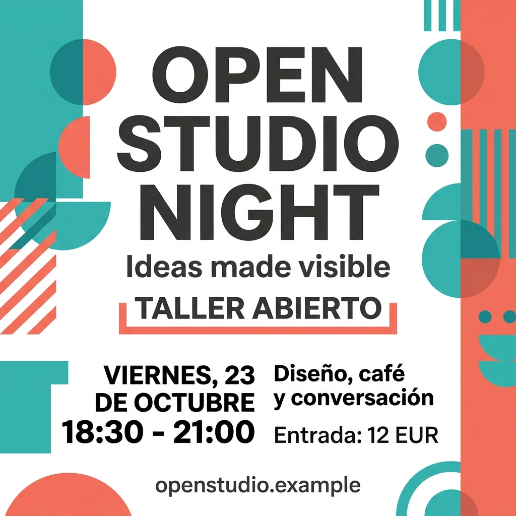
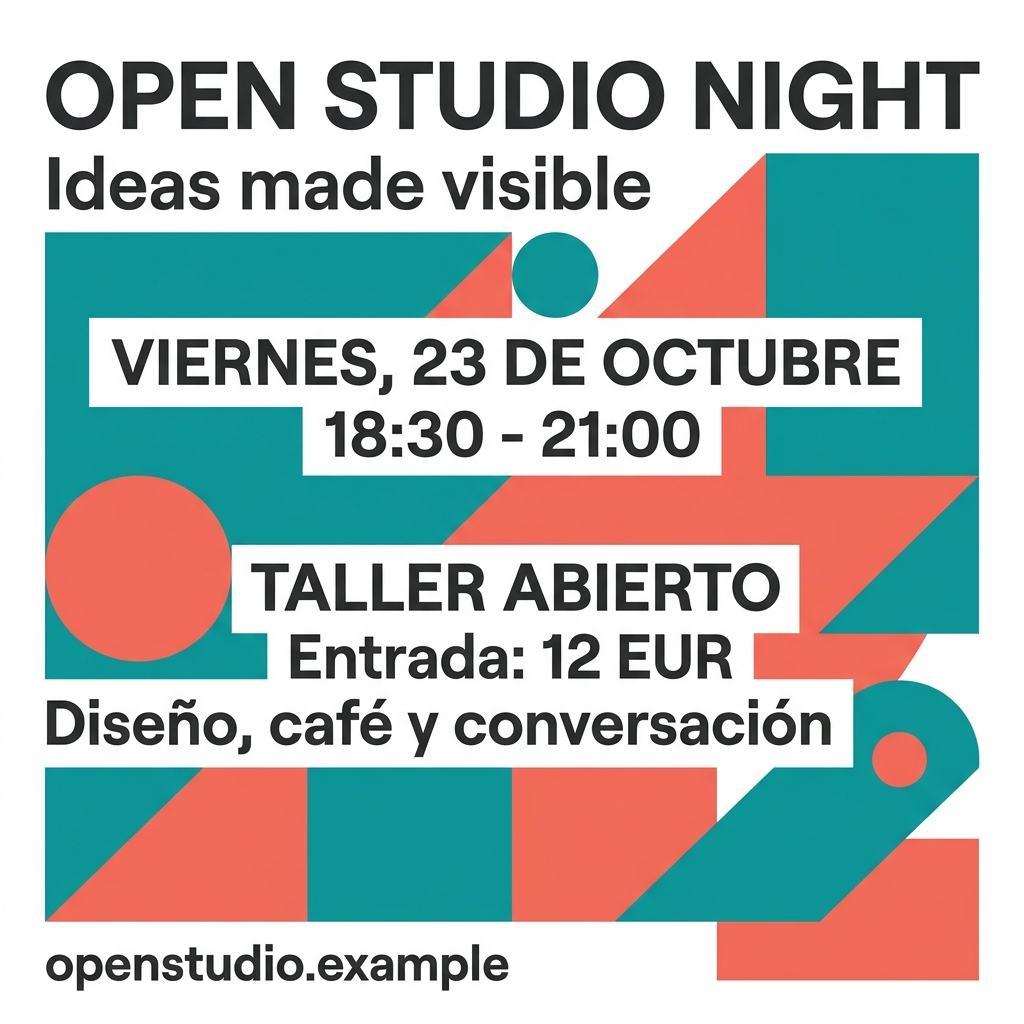
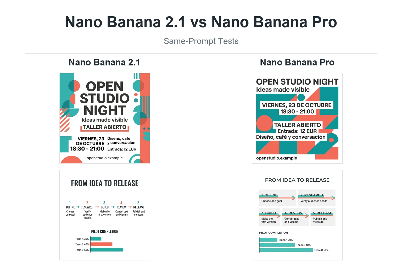
Both outputs preserve all eight required text strings in this paired attempt.
- Both keep the Spanish accents, date, time, 12 EUR price, and openstudio.example URL readable.
- Pro keeps the headline and date on single lines. White text bands make the event information easy to follow.
- 2.1 spreads the headline over three large lines and uses two lower columns for the event details. It is a different layout choice, rather than a text error.
Both are usable starting layouts for the brief. This pair gives no text-accuracy reason to pay Pro’s higher official image-output fee. Layout preference and downstream editing can still change the choice.
2. Infographic accuracy and chart proportions
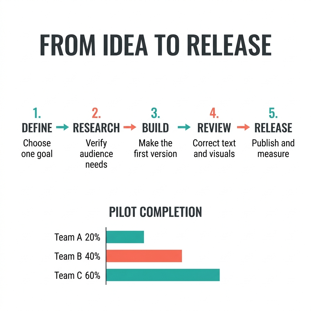
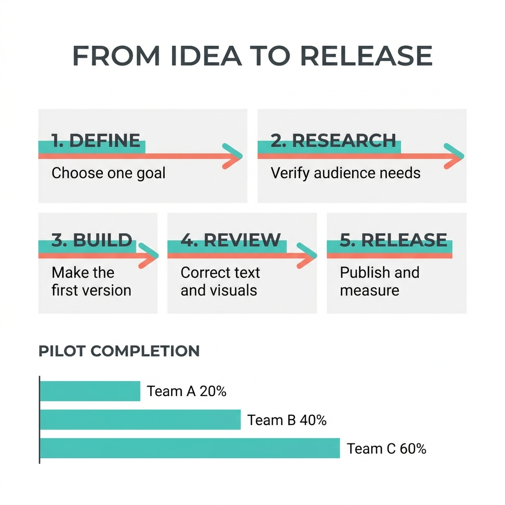
タスクの設定: Five ordered steps joined by four arrows, plus bars for 20%, 40%, and 60%. The values must be correct and the bars must reflect the 1:2:3 relationship. We also check whether the reading order is obvious at normal viewing size.
Those details matter more than a decorative chart style. Use our tutorial-graphics guide to separate instructional content from visual styling in a production prompt.
Exact prompt used for both options
Create a square, professional infographic on a white background titled exactly FROM IDEA TO RELEASE. Across the upper two-thirds, arrange five equal steps in one left-to-right sequence, connected by exactly four right-pointing arrows. Use clean charcoal sans-serif text with teal and coral accents. Include exactly these numbered titles and supporting lines once:
1. DEFINE / Choose one goal
2. RESEARCH / Verify audience needs
3. BUILD / Make the first version
4. REVIEW / Correct text and visuals
5. RELEASE / Publish and measure
Along the bottom, include a small horizontal bar chart titled PILOT COMPLETION, with exactly these three labeled values: Team A 20%, Team B 40%, Team C 60%. The three bars must share a zero baseline and have lengths in the ratio 1:2:3. Do not add other numbers, steps, percentages, labels, decorative text, repeated content, or a footer. Keep every word and value readable.
Paired attempt 1
Paired attempt 2
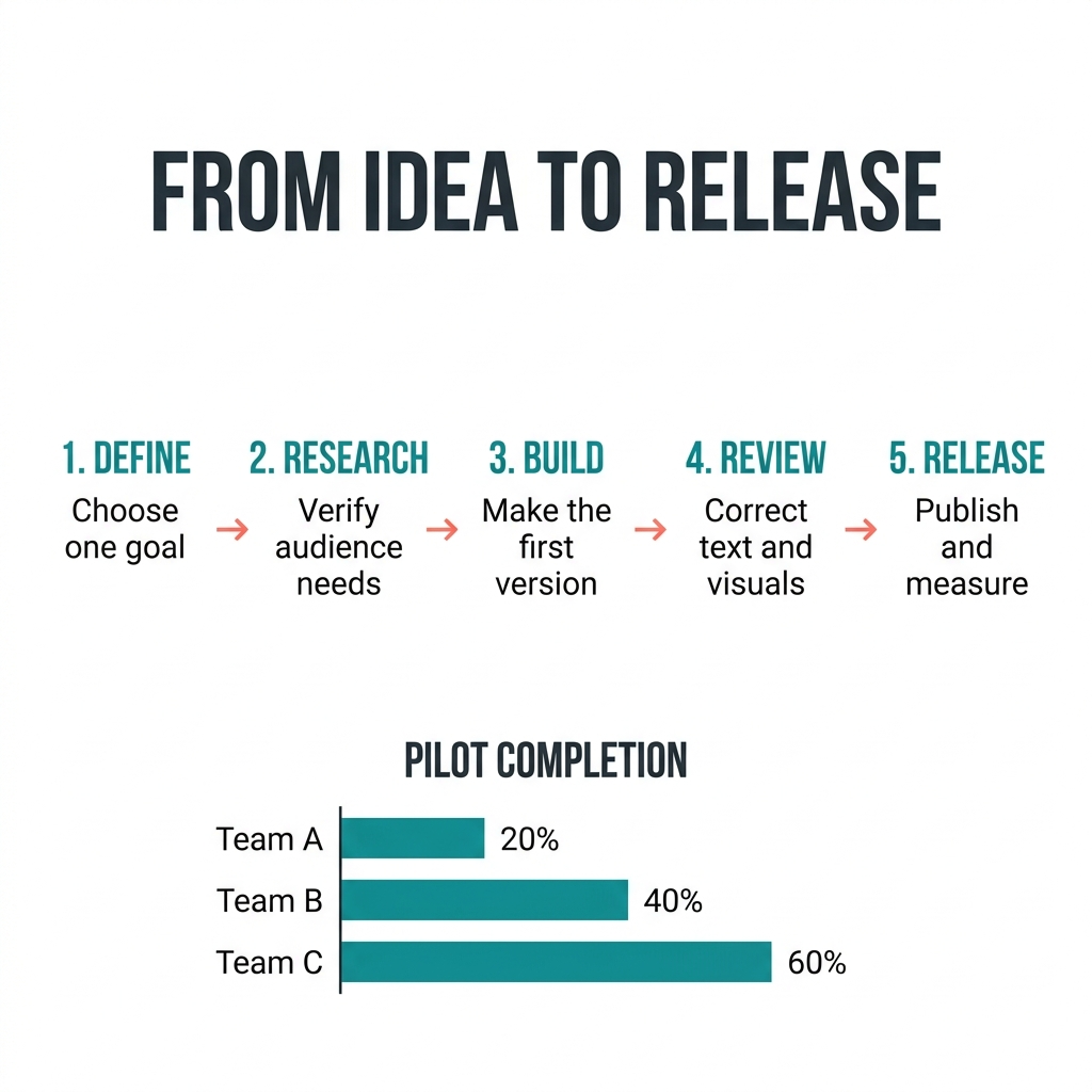
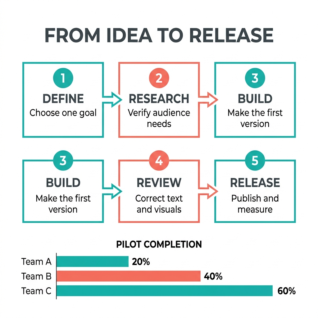
2.1 keeps the requested five-step row in both attempts; Pro changes the layout and duplicates a step in its second attempt.
- All four outputs show Team A 20%, Team B 40%, and Team C 60% with approximately 1:2:3 bar lengths.
- 2.1 keeps five unique steps in a single left-to-right row with four connecting arrows in both samples.
- Pro’s first sample puts two cards above three. Its second has six cards because 3 BUILD / Make the first version appears in both rows. Both need restructuring to match the requested five equal horizontal steps.
For this slide-style infographic brief, 2.1 needs less structural rework across the two paired attempts. Accurate chart labels do not make Pro’s duplicated or rearranged process ready to publish.
3. Product photography and spatial control
タスクの設定: Exactly three objects: a glass perfume bottle in the center, a coral cube on the left, and a teal sphere on the right. All must rest on the tabletop, with coherent left-side lighting and plausible glass, metal, and paper materials.
We check object count and placement before judging realism. An attractive additional prop would still require correction because the product brief explicitly excludes it.
Exact prompt used for both options
Create a square commercial studio photograph of exactly three unbranded objects on a pale gray stone tabletop against a seamless white background. The main object is a cylindrical clear-glass perfume bottle containing pale green liquid, with a brushed silver cap and a blank matte white paper label; position it in the center. Place one small matte coral cube to the bottle's left and one small polished teal sphere to its right. All three objects must be separate, fully visible, upright where applicable, and touching the tabletop; the bottle must be taller than both props. Use a large softbox on the left, controlled reflections on the right, and contact shadows. Show a clearly recognizable eye-level three-quarter view, fine metal brushing and convincing glass refraction. No other objects, text, logos, duplicate items, floating objects, or watermark-like graphics.
Paired attempt 1
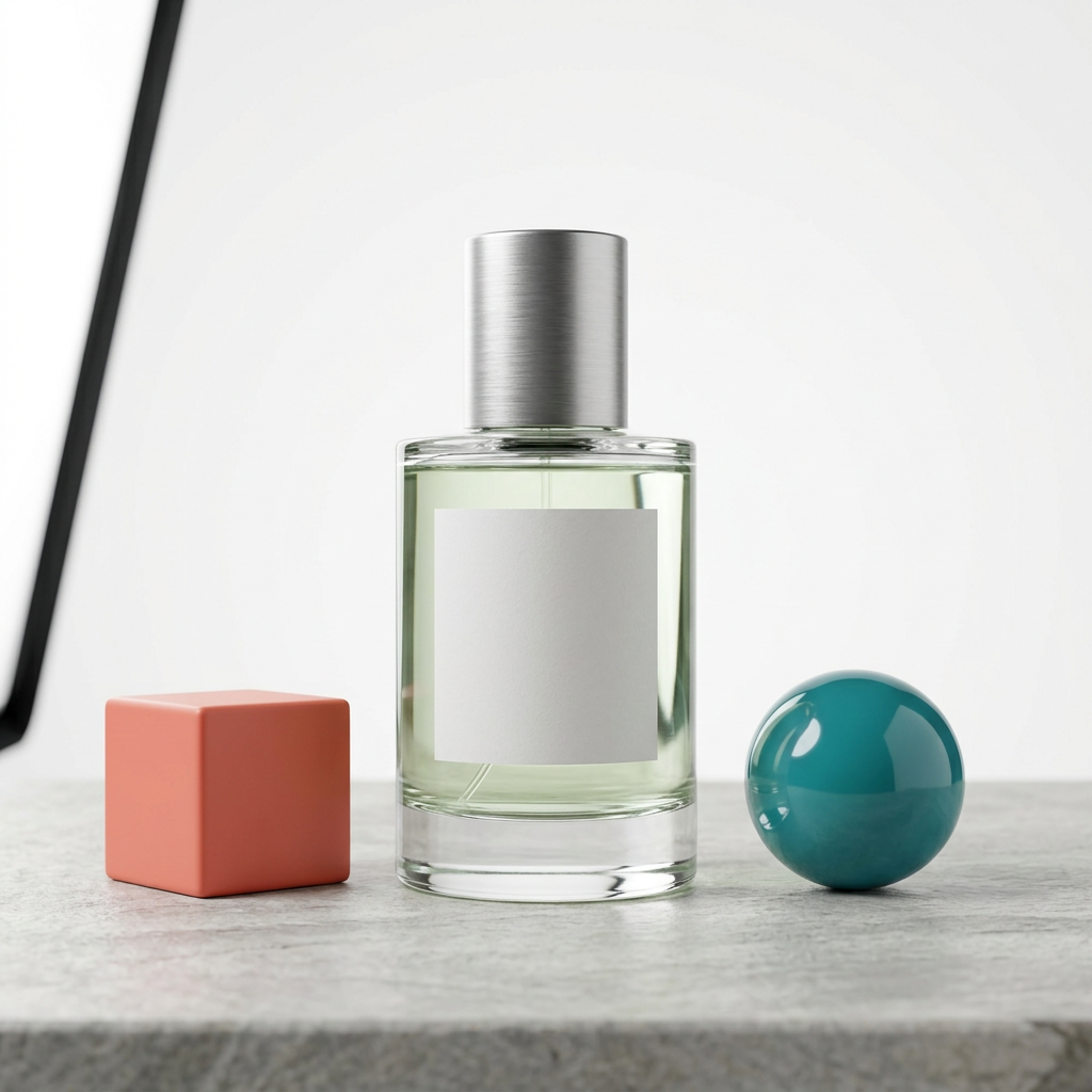
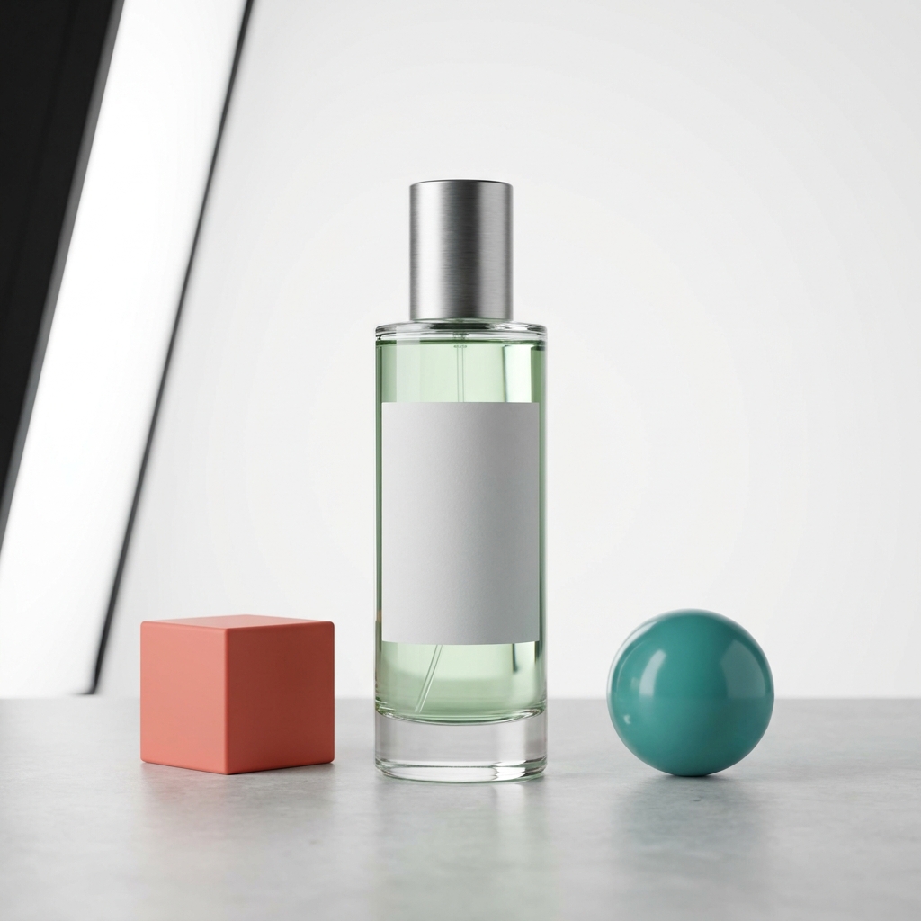
The three main objects are correctly placed, but both samples need background cleanup.
- Both put the coral cube left, the perfume bottle in the center, and the teal sphere right. The bottle is taller, and all three objects contact the tabletop.
- Both render a brushed metal cap, pale green liquid, a blank paper label, and distinct glass reflections.
- Both also draw part of the lighting equipment into the left edge. The black frame breaks the no-extra-objects and seamless-white-background requirements.
An attractive studio photo can still miss a catalog brief. Here, choosing either output means removing the visible fixture or testing a revised off-camera-lighting prompt; this test provides no fully compliant first-attempt product photo.
4. Precise local edits
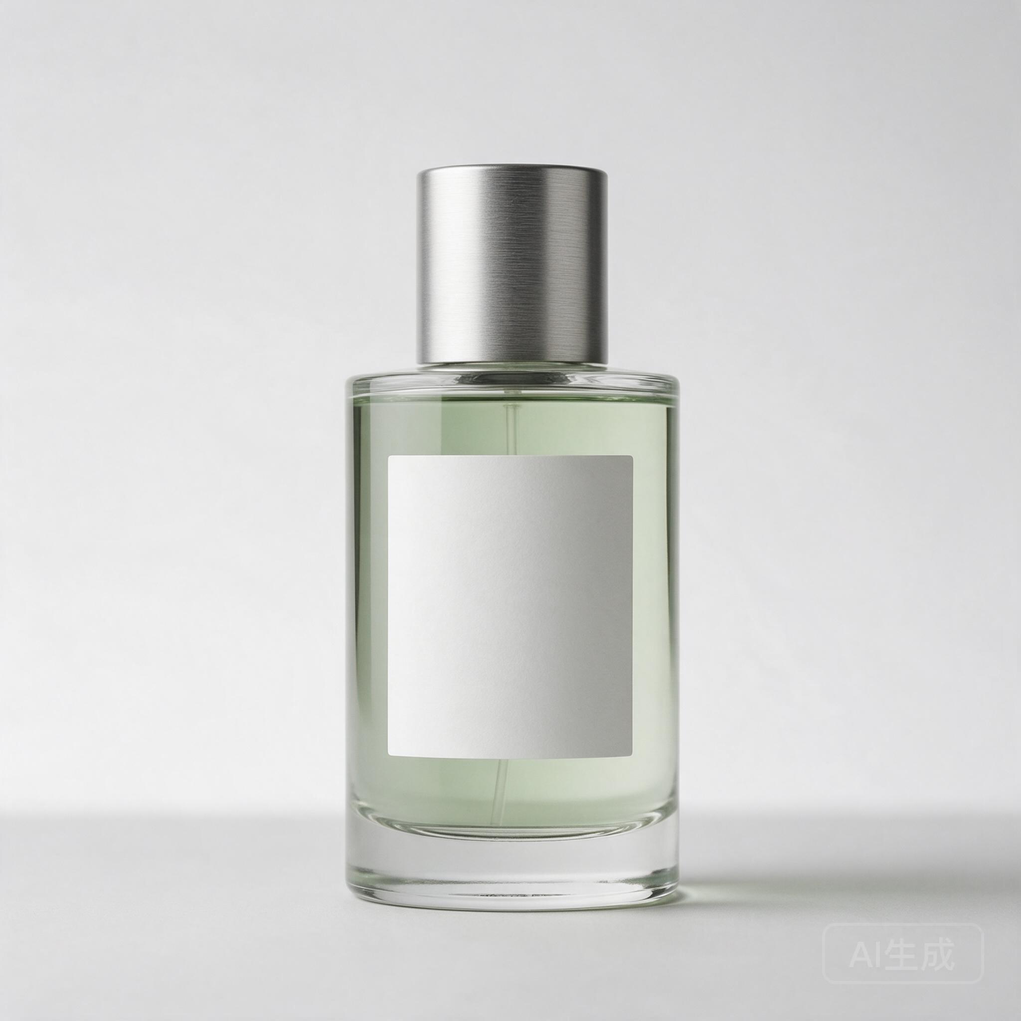
タスクの設定: Change only the blank bottle label from white to muted teal, approximately #6B9D98. Keep it blank and preserve the bottle geometry, liquid, lighting, shadows, background, and framing.
This is a preservation task. A result can look cleaner while drifting from the source; altered cap edges, new reflections, or a different crop count as unwanted changes.
Exact prompt used for both options
Edit the supplied product image. Change only the blank label background from white to muted teal, approximately #6B9D98. Keep the label blank. Preserve the bottle, cap, pale green liquid, reflections, lighting, shadows, background, camera angle and overall framing. Do not add any lettering, objects, redesign the label, sharpen the whole image or restyle the photograph. Return one square image.
Frozen reference input:
Paired attempt 1
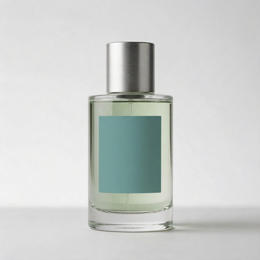
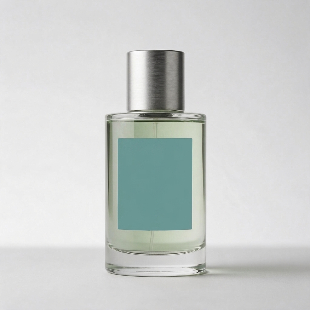
Both recolor the blank label and retain the bottle’s recognizable shape and framing.
- Both keep the cap, pale green liquid, blank label, light direction, and rightward contact shadow recognizable. Neither adds text or objects.
- 2.1 leaves more visible light-to-dark shading across the teal label. Pro renders a more even teal surface. The prompt asks for an approximate color, so this is an appearance difference rather than an exact-color pass/fail result.
- The source image’s faint lower-right generation mark disappears in both outputs. These are visually close edits, but neither is evidence that only the requested label area changed.
Both are useful recoloring results for this synthetic product. If a production workflow requires every other region to stay untouched, inspect the complete image or finish the edit with a mask-based tool. This blank-label test does not establish printed-label preservation.
5. Character consistency across scenes
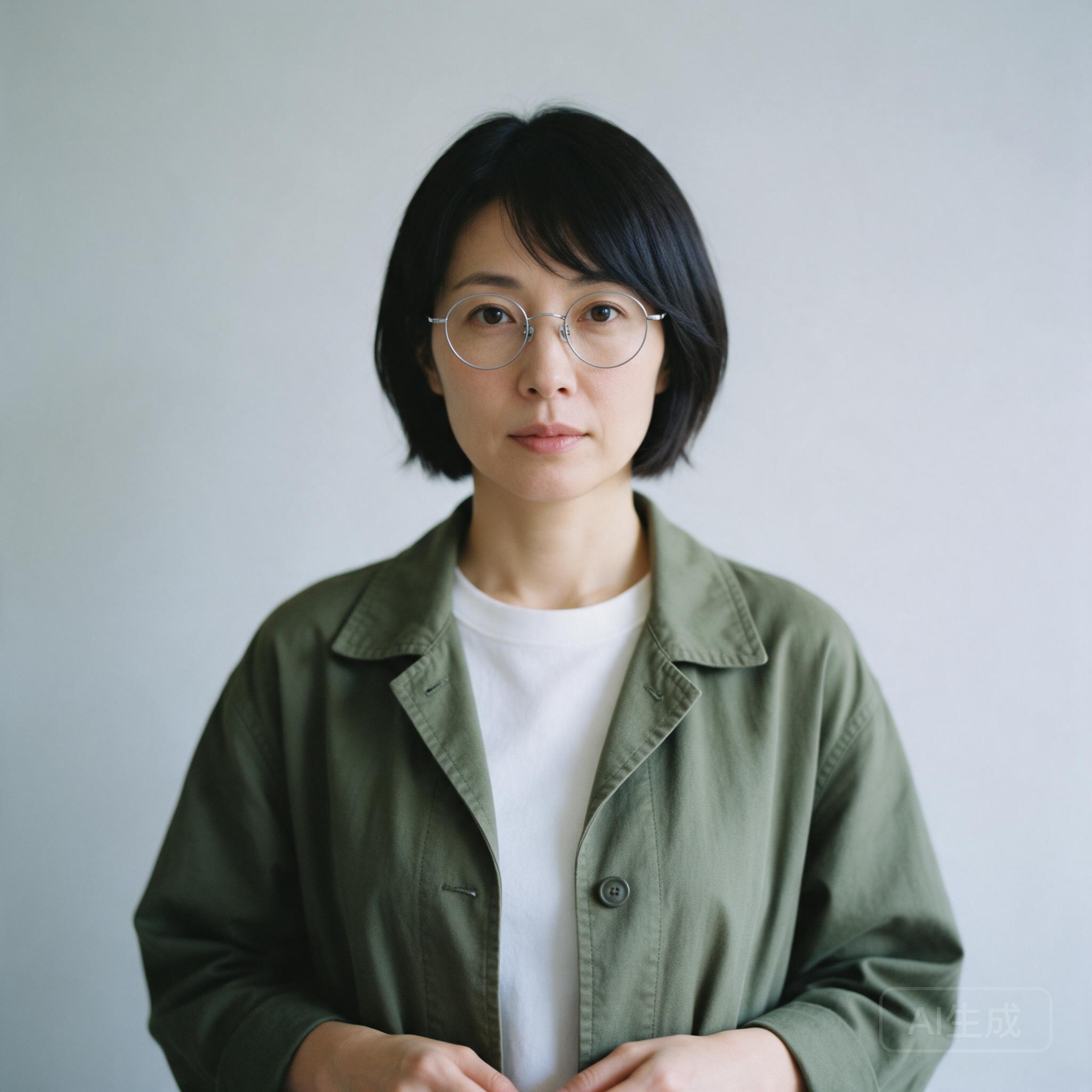
タスクの設定: One fictional adult appears in two equal panels. In daylight outside a bookstore, she holds a navy notebook; in an evening cafe, the notebook sits on the table. Her face, bob haircut, round glasses, olive jacket, and white shirt should stay consistent.
We inspect identity and the notebook’s placement separately. Similar styling across two portraits is weaker evidence than a recognizable match to the actual reference.
For a repeatable series, our character-consistency workflow explains how to anchor each new scene to an input portrait.
Exact prompt used for both options
Use the supplied fictional adult reference as the same person in both panels of one square image. Create two equal vertical panels separated by a narrow clean white divider. Left: the person stands waist-up outside a modern bookstore in daylight and holds a closed navy notebook in both hands. Right: the same person sits waist-up at a cafe table in warm evening light, with the closed navy notebook on the table. Preserve the reference face, hairline, hairstyle, glasses, jacket color and shirt details. Use a realistic photographic style. No captions, storefront lettering, extra people, bags, hats, added accessories or change of identity.
Frozen reference input:
Paired attempt 1
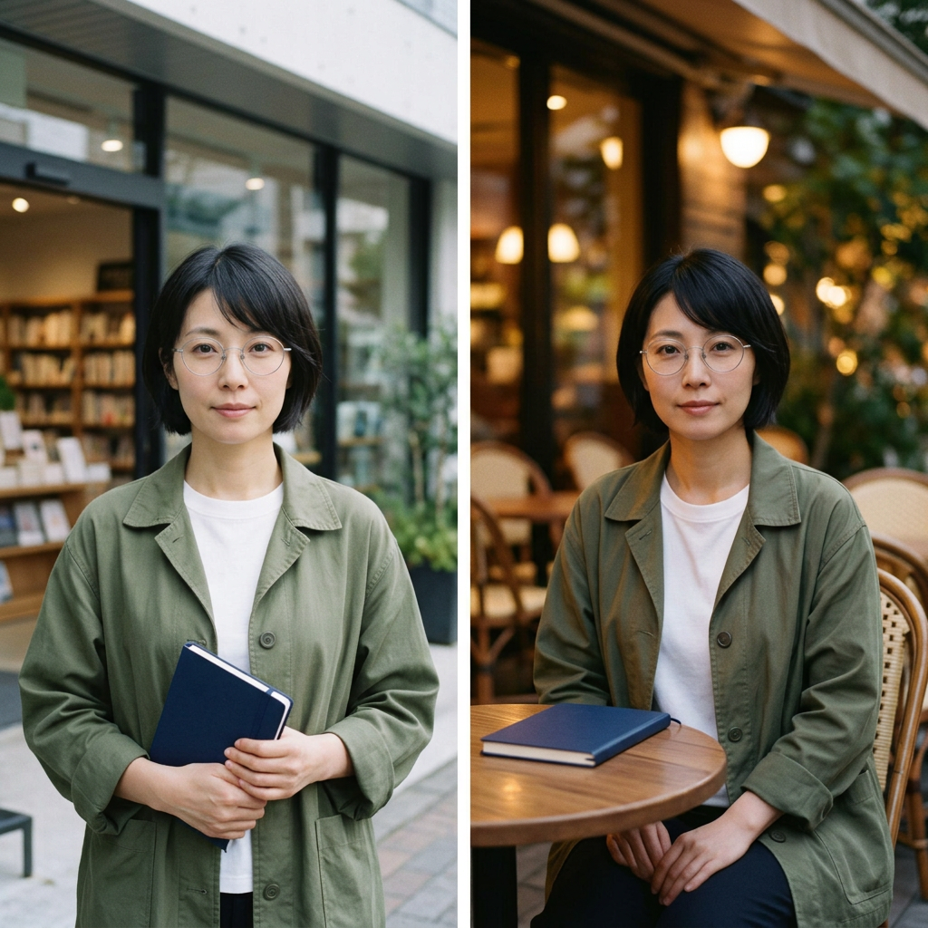
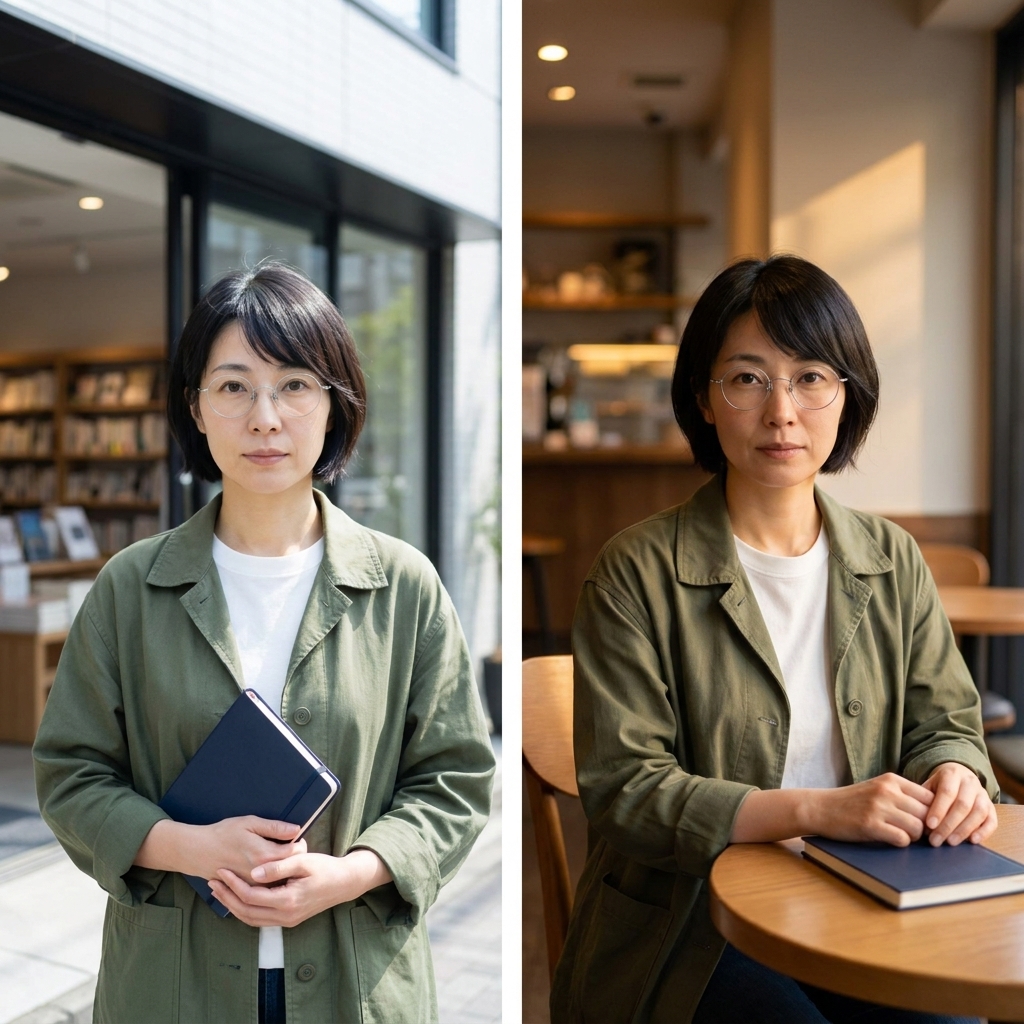
Both carry the recognizable reference appearance into the two requested scenes.
- Both retain the short black bob, thin silver round glasses, olive jacket, and white crew-neck shirt, with a recognizable resemblance to the input portrait.
- Both use two vertical panels and a narrow white divider. The navy notebook is held in the left panel and rests on the table in the right. No extra people or readable storefront lettering appear.
- 2.1 places the evening cafe scene at an outdoor table; Pro uses an indoor cafe with warm side lighting. The brief did not require an indoor setting.
Both samples are usable evidence of single-reference, two-panel consistency. This is one generation per option, not a multi-turn identity test or proof of consistency across an entire campaign.
6. Two-reference product advertising
タスクの設定: Put the bottle from the product reference into the separate warm tabletop scene. Keep the label blank, place one bottle slightly left of center, and leave the right third open for later ad copy. Preserve the scene’s light direction without importing the product reference’s background.
私たちの multiple-image blending guide explains the same practical distinction: tell the model which reference supplies the product and which supplies the environment.
Exact prompt used for both options
Create a square photographic product-ad visual using both supplied references. Reference 1 defines the exact perfume bottle, cap, pale green liquid and blank label. Reference 2 defines the tabletop, wall colors, sunlight direction and scene style. Place one bottle from reference 1 upright on the tabletop in reference 2, fully visible, slightly left of center, with a believable contact shadow and reflections consistent with that scene. Keep the product label blank. Leave the right third as clean negative space. Keep the scene visually photographic. Do not add a headline, body copy, lettering, other products, extra props, people, logos or borders. Do not redesign the product or copy the product-photo background into the new scene.
Frozen reference inputs:
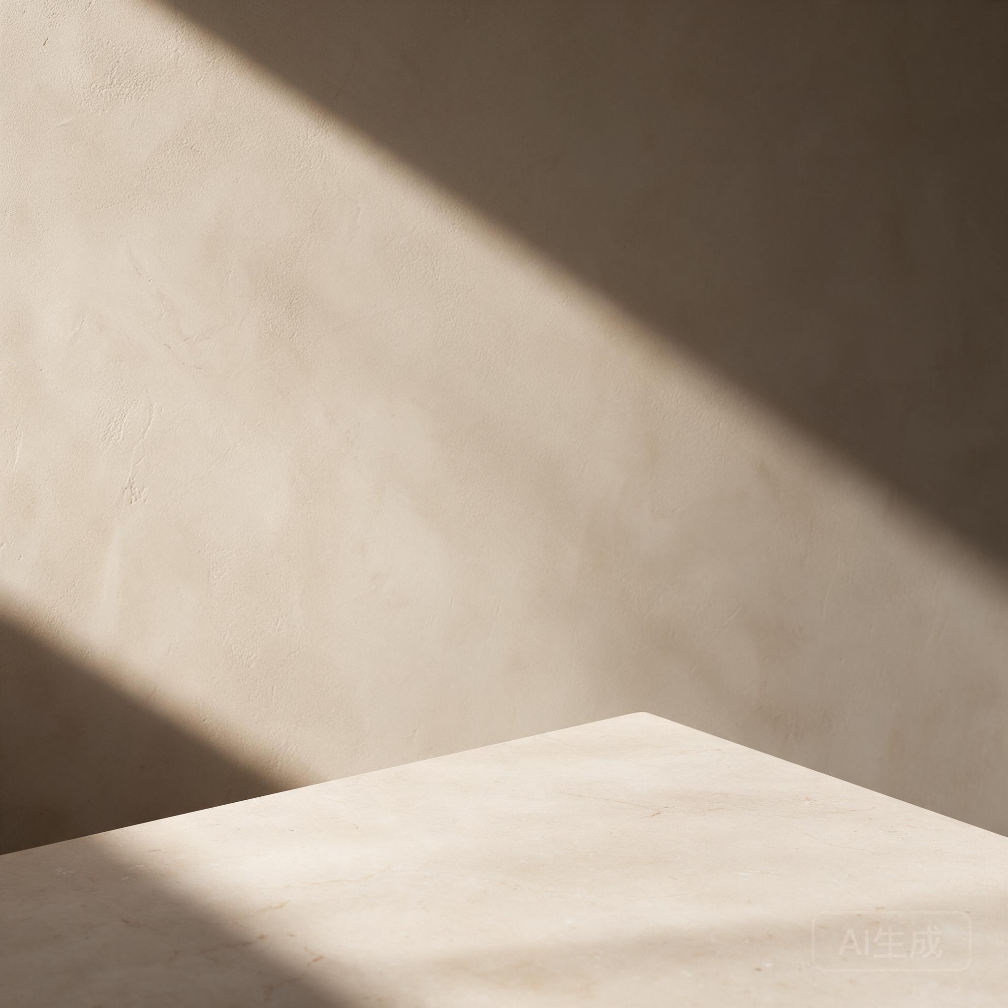
Paired attempt 1
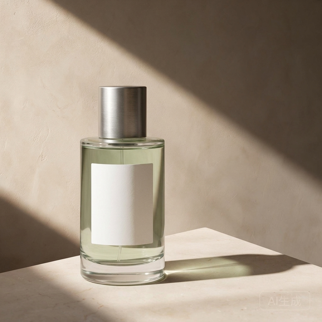
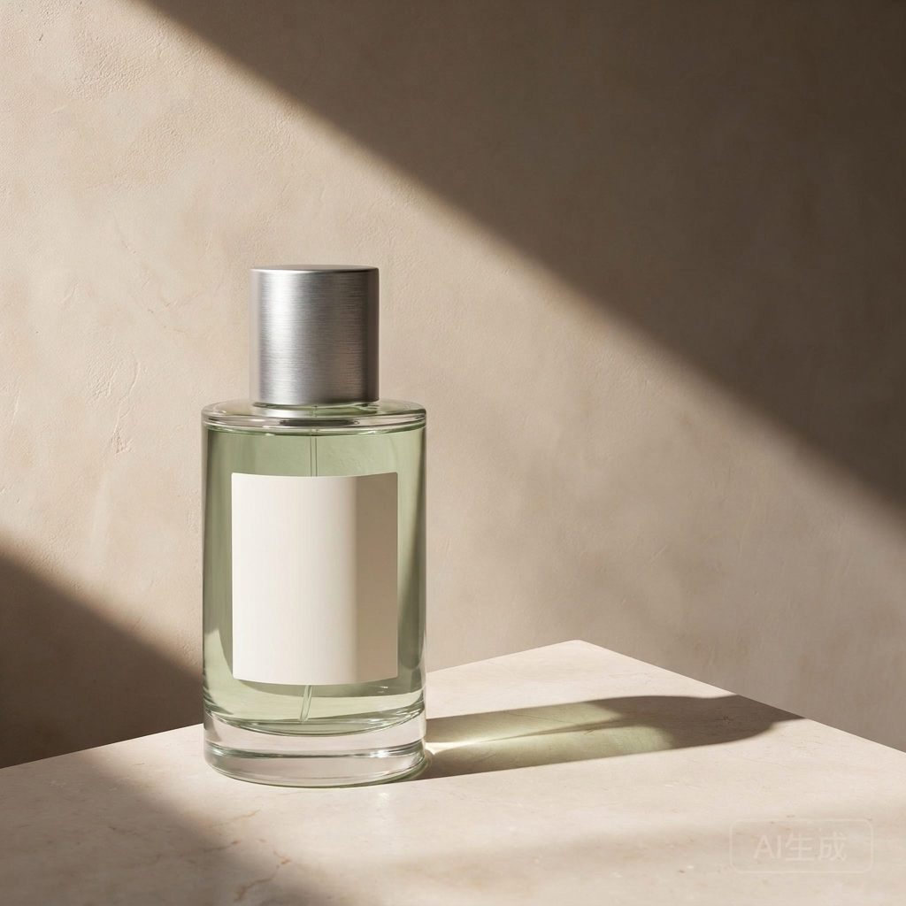
Both combine the supplied product and environment, with usable space for ad copy.
- Both keep one cylindrical bottle, a silver cap, pale green liquid, and a blank label, placed left of center. The stone tabletop, sand-colored wall, and diagonal light pattern come from the scene reference.
- Both give the bottle a grounded contact shadow extending right and adapt its reflections to the warm light. Neither imports the gray-white product-photo background or adds props.
- 2.1 makes the bottle larger in the frame; Pro places a smaller bottle farther left. Both leave the main right-side area open. Both also retain the scene reference’s faint lower-right generation mark, which needs attention before a final ad is used.
Both show practical two-reference compositing in this pair. Choose the product scale that fits your copy layout, then check the source mark and actual brand details. The blank label means this does not test logo or printed-label fidelity.
Speed and Official API Pricing
Recorded task-completion intervals
| Paired task | Nano Banana 2.1 | ナノバナナプロ |
|---|---|---|
| Bilingual poster | 60 s | 44 s |
| Five-step infographic · pair 1 | 43 s | 35 s |
| Five-step infographic · pair 2 | 70 s | 49 s |
| Three-object product photo | 29 s | 37 s |
| Blank-label recolor | 61秒 | 33 s |
| Two-panel character scene | 69秒 | 36 s |
| Two-reference advertisement | 22 s | 40 s |
Each value uses the same task service’s completed timestamp minus submitted timestamp. It includes queueing, generation, and service handling; local polling and file-download delays are excluded. These are recorded intervals for the named API options, not direct Google API latency measurements or pure model inference times.
What the official rates measure
グーグルの standard Gemini API prices use separate rates for input, text/thinking output, and image output. All values below are USD, checked October 8, 2026.
| Billing category, per 1 million tokens | Nano Banana 2.1 | ナノバナナプロ |
|---|---|---|
| テキスト/画像の入力 | $1.50 | $2.00 |
| テキストと思考の成果 | $7.50 | $12.00 |
| 画像出力 | $30.00 | $120.00 |
2.1 also lists video input at its input rate. The table compares categories used in these image tasks.
| Official image-output example | Nano Banana 2.1 | ナノバナナプロ | Pro / 2.1 |
|---|---|---|---|
| One 1K image | $0.0336 | $0.134 | 3.99× |
| One 2K image | $0.0504 | $0.134 | 2.66× |
| One 4K image | $0.113 | $0.24 | 2.12× |
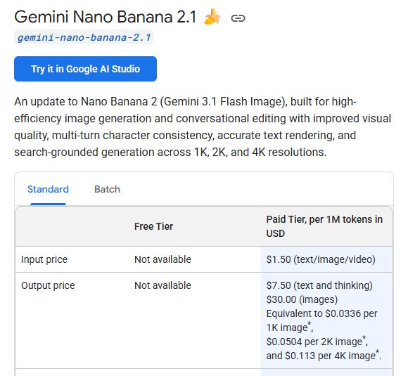
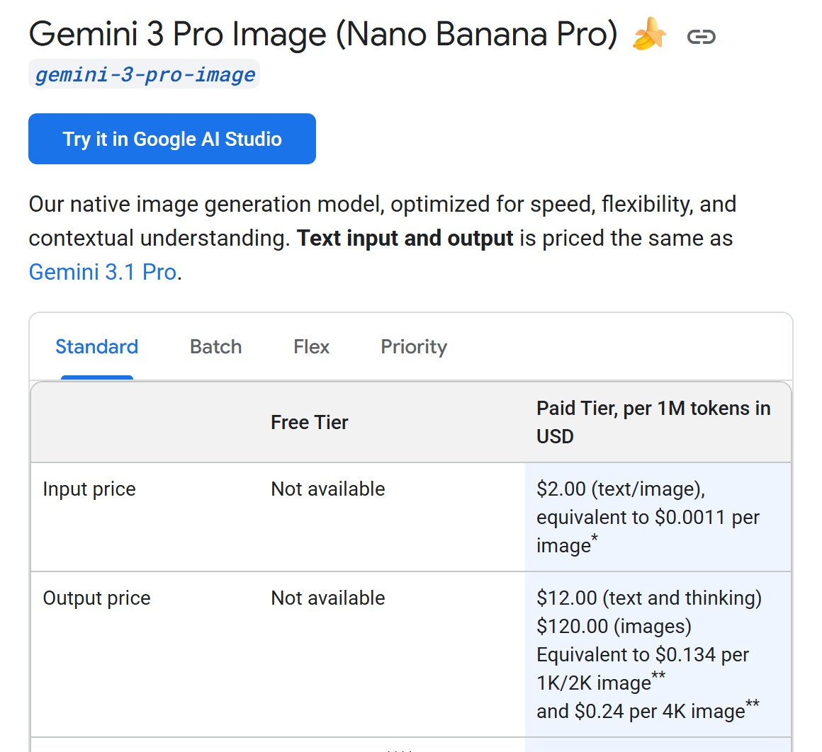
These are image-output fees, not total request bills or charges measured in our tests. Prompt tokens, reference-image input, text/thinking output, and any enabled search can add cost. The 4K figure for 2.1 follows Google’s rounded documentation example.
Estimating a request from billable tokens
To price a request from measured usage, multiply each returned billable category by its own official rate, then divide by one million. A single total-token figure is not enough to split input, text/thinking, and image output correctly. Our Nano Banana Pro APIガイド covers the API workflow; this review keeps the cost calculation tied to the returned categories.
What the Tests Mean: Quality, Correction Effort, and Value
Text-heavy designs: accuracy and hierarchy are separate
The poster pair does not support paying more for Pro solely to get correct text. Both keep the eight required strings, including the Spanish accents and small URL. Pro gives the headline and date a single line each; 2.1 uses a much larger three-line headline. That changes the reading experience, without making either version’s wording wrong.
The infographic is more decisive within these samples. Both options get the percentages and bar proportions right, but 2.1 also keeps five unique steps in the requested horizontal sequence in both attempts. Pro’s two-row redesign already requires layout work; duplicating BUILD in its second sample adds a content correction. For this five-step instructional brief, 2.1 is the stronger starting point.
Product realism does not establish brief compliance
Both product photos distinguish glass, brushed metal, paper, and colored props. They also bring lighting equipment into the frame. Choosing the more attractive photo would still leave a cleanup job. The prompt’s reference to a left-side softbox is a useful lesson: production lighting instructions should say the fixture is off camera. That revision is a next test, not a demonstrated fix.
Reference control: a useful edit can still change the source
The label-recolor pair preserves the recognizable bottle and framing, with the requested blank teal label. It also removes a faint source-generation mark in both outputs. That difference matters when your brief says to change only one region: checking the label alone would miss an extra alteration. Neither sample establishes pixel-exact preservation outside the edit.
The character pair meets the requested two-scene setup and notebook placement, with a recognizable resemblance to the supplied portrait. Pro uses a warm indoor cafe, while 2.1 uses an outdoor cafe table. Both interpretations fit the brief. One two-panel image per option gives no basis for declaring a long-series identity winner.
The two-reference ad pair combines the correct bottle and warm scene in both outputs. 2.1 gives the product more of the frame; Pro leaves more room around a smaller bottle. Both preserve the source scene’s lower-right generation mark. For these reference tasks, the useful distinction is the remaining production work, rather than an unsupported claim that Pro always preserves identity better. Our blank-label inputs do not test printed brand names or logos.
What the price gap means for correction work
- 1K: Pro’s listed image-output fee is 3.99 times 2.1’s.
- 2K: The ratio drops to 2.66 times.
- 4K: It drops to about 2.12 times.
The cheaper output component and lower observed restructuring burden point in the same direction for our infographic brief. The poster pair also gives no text-accuracy benefit that would justify the higher fee. These are useful reasons to start a similar trial with 2.1, rather than assuming Pro’s positioning will translate into fewer corrections.
For finished work, calculate cost per usable asset = billed spend across attempts ÷ usable assets, then track correction time separately. Our comparison of official rates and visible correction needs supports a task-specific value judgment, not a measured savings percentage or long-run acceptance rate.
どちらを選ぶべきでしょうか?
Start with 2.1 for a similar text-and-diagram brief. Test Pro when a specific layout or preservation requirement could justify its higher official output fee, and judge the returned image against that requirement. Our Nano Banana Pro プロンプトガイド can help turn that trial into a concrete brief.
よくある質問
Is Nano Banana 2.1 the same as Nano Banana 2?
No. Google lists Nano Banana 2.1 as gemini-nano-banana-2.1. Nano Banana 2 uses gemini-3.1-flash-image. Results or benchmark scores for the older model should not be relabeled as 2.1 evidence.
What is the official API name for Nano Banana Pro?
Google’s current stable model ID is gemini-3-pro-image. Use the exact ID in the official Gemini API; a third-party option with a similar label still needs its model mapping checked separately.
Is Nano Banana 2.1 cheaper than Nano Banana Pro?
At Google’s standard rates, the listed 1K image-output fees are $0.0336 for 2.1 and $0.134 for Pro. Those examples exclude other billable categories and are not the complete cost of a finished design.
Can both models generate 4K images?
Yes. Google’s image-generation guide lists 1K, 2K, and 4K output for both. The requested resolution and the actual returned dimensions are separate facts; this review records the native files it receives.
Which is better for text-heavy posters and infographics?
In the poster pair shown, both options preserve all eight required text strings. In two infographic pairs, 2.1 keeps the requested five-step horizontal sequence; Pro rearranges it and repeats BUILD in one output. That favors 2.1 for this specific infographic brief, without proving a universal text-rendering winner.
How many reference images do they support?
The official guide lists up to 14 total references for each, with different object, character, and style sublimits. This comparison uses only one or two frozen references, so it does not test the maximum input limit.
Did these tests use Google Search grounding?
No search tool was requested. The factual infographic uses values supplied directly in the prompt. Its results should not be interpreted as a test of web research, current information, or search-grounded image generation.
Do two attempts show which model is more reliable?
Two paired attempts expose variation within the infographic task, but do not establish a general reliability rate. The attempt labels show the actual sample coverage for each task; conclusions are limited to the returned images.